The first and most important factor in getting your online traffic to convert into actual sales is getting the people who find your website to stay. You only have ten seconds to capture the attention of a new viewer, because that’s how long it takes them to decide if they’re leaving or staying. In this time, you have to communicate the value of your products or services (this is called your value proposition), as well as show that your website has what the user needs to find. One effective way to do the latter is to update your website navigation.

Website navigation is made up of the organizational features of your website that ideally allow visitors to find what they are looking for, or move from one page to the next in a logical manner. Website navigation typically takes the form of a menu of internal links in the website’s header, and may also include sidebar and footer menus.
A website’s navigation is a key part of its overall user experience. Poorly designed and organized navigation leads to a frustrating experience that will likely lead to a high bounce rate rather than audience retention. Remember, if the people looking at your website can’t find your content, it doesn’t matter how valuable or well-written it is.
At KISS PR, we specialize in building a credible, coherent brand identity for our clients and partners. Your company’s brand identity is more than just how your website and social media pages look. If you want to create a friendship with a potential client so that you come to mind first when they’re in need of a service in your niche, a positive user experience is essential. If something as simple as navigating your website leaves a new viewer frustrated and confused, they’re unlikely to expect anything more from your products or services.

Here are our steps for creating an effective website navigation.
Before you get started on your website navigation, think about your existing website. Is it visually appealing? Is it cohesive? Do the headings and images displayed on your homepage make it clear what your business is all about? If not, it’s probably time to consider revamping your website. (For a free website revamp consultation, click here.)
The first step to creating a streamlined website navigation is building a content map. This will help you determine which headings will be in your main header, footer, and each level of your dropdown menus. Start by listing out all the major categories of your content, and organize your pages underneath these headings. For example, the larger category of “about” might include your company’s mission statement, history, and information about your team. Creating an organized content map is especially important if you already post blog content to your website.
A customer journey is a user-experience (UX) tool used to put yourself into the shoes of your customer to help make their experience with using your interface better. Think about your ideal customer. How would they find your company? What would they be looking for in order to do so? (There may be multiple channels, or potential ways that they would find you.) Consider the different phases of product selection that a customer might be going through when they find your website, and which pages of your website correspond to these points. This will help you use the correct calls to action in the correct places, and word your headings in a way that appeals to and feels relevant for the user. In the niche of lawyer marketing, for example, if a customer is browsing the web for an answer to a legal question that they’re simply curious about, they’re probably more likely to be interested in signing up for your newsletter than in having a case evaluated.
Lengthy headings are unappealing and interrupt the flow of your menu, and aren’t appropriate for the small footer menu that should be at the bottom of your webpage. Once you’ve determined what content you have and what your audience is looking for, you can play around with the words you use in your headings. Main headings, which will be visible in the main header and footer menu, should use as few words as possible, while subheadings can be a bit longer.
Adding a call-to-action button allows you to send users closer to conversion without them having to go through every single page to figure out what step you want them to take next. This can be something as simple as “Get Started” or “Contact Us,” or something more specific to your niche.

Now that you know the basic steps of building a website navigation, here are some extra tips and tricks that will help you along the way.
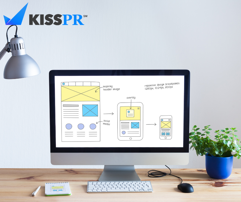
Responsive design is one of the most important factors to consider. Almost 60% of all Google searches are done from mobile devices. Your website navigation might look great and function wonderfully in desktop view, but if it’s a mess on mobile, you’ll be losing out on retaining more than half of your visitors. Don’t let mobile design be an afterthought; it should be one of the first things you think about as you start creating your responsive design.
A sticky header, or a fixed header, keeps the menu at the top of the user’s screen, making navigation around the site quicker and easier. We recommend experimenting with a sticky header and seeing if there is a difference in your bounce rate and audience retention between when you use a sticky header and when you don’t. Opt for whichever option your audience prefers.
If your business model is complex and you provide a lot of different products and services, or you’ve just been uploading content to your website for a long time, your content map is probably broken down into a large number of headings and subheadings. Having more levels of organization is great, and shows cohesiveness and command over your niche in the content you post, but having dropdown menu after dropdown menu expand into yet more dropdown menus can be confusing and off-putting for users. Instead, try using a mega-menu, where a dropdown menu immediately shows a larger detail broken down into headings.
Need some inspiration? Check out these examples of great web navigation design!
At KissPR, we understand that the quality and value of your content don’t matter if no one ever finds it. As well as optimizing content for search engines and writing and promoting content, we design websites for our clients that optimize the user experience, help you boost conversion, and create long-term connections with audience members. Book a free consultation with a web design and optimization expert.